MissTea – E-commerce Revamp
English
MissTea is a New York-Based tea brand that was looking to revamp its overall branding, packaging, and E-commerce while maintaining a friendly, approachable look.
Español
MissTea es una marca de té con sede en Nueva York que buscaba renovar por completo su branding, empaque y e-commerce, manteniendo una estética amigable y cercana.
Client
MissTea
Year
2022
Tasks
UX UI Design
Branding
Prototyping
Usability Testing
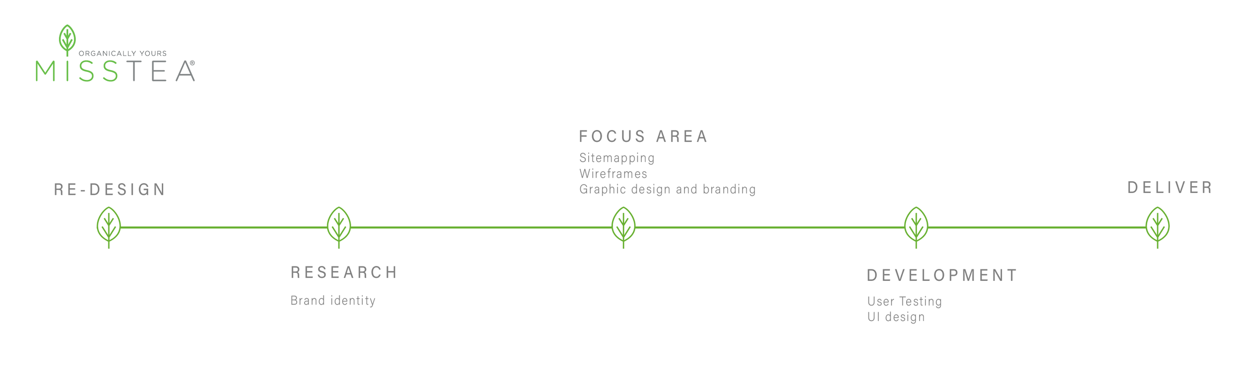
The Problem
The navigation flow was not intuitive or user-friendly
Branding elements were not cohesive
Product structure and organization were unclear
The Challenge
Redefining visual brand identity
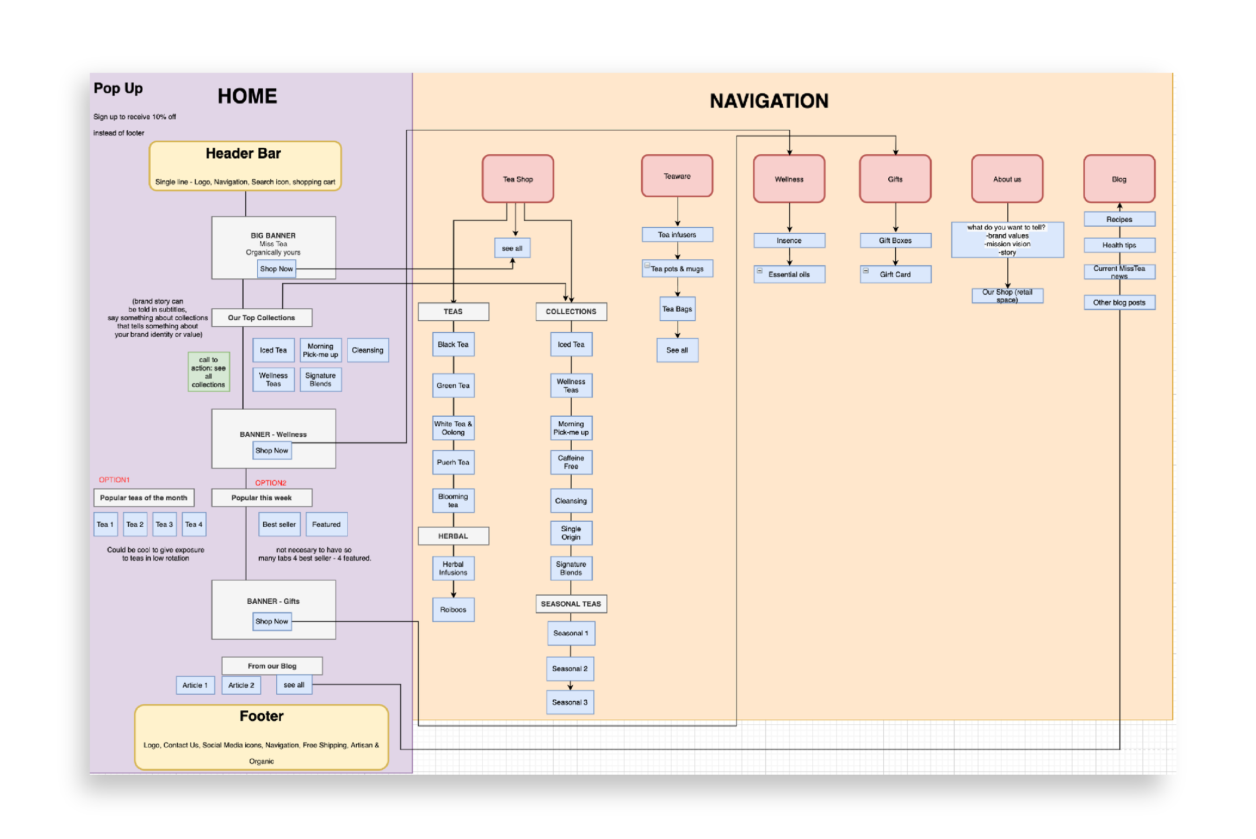
Creating detailed sitemaps for website navigation
Structuring product information through information architecture
Developing and refining UX and UI design
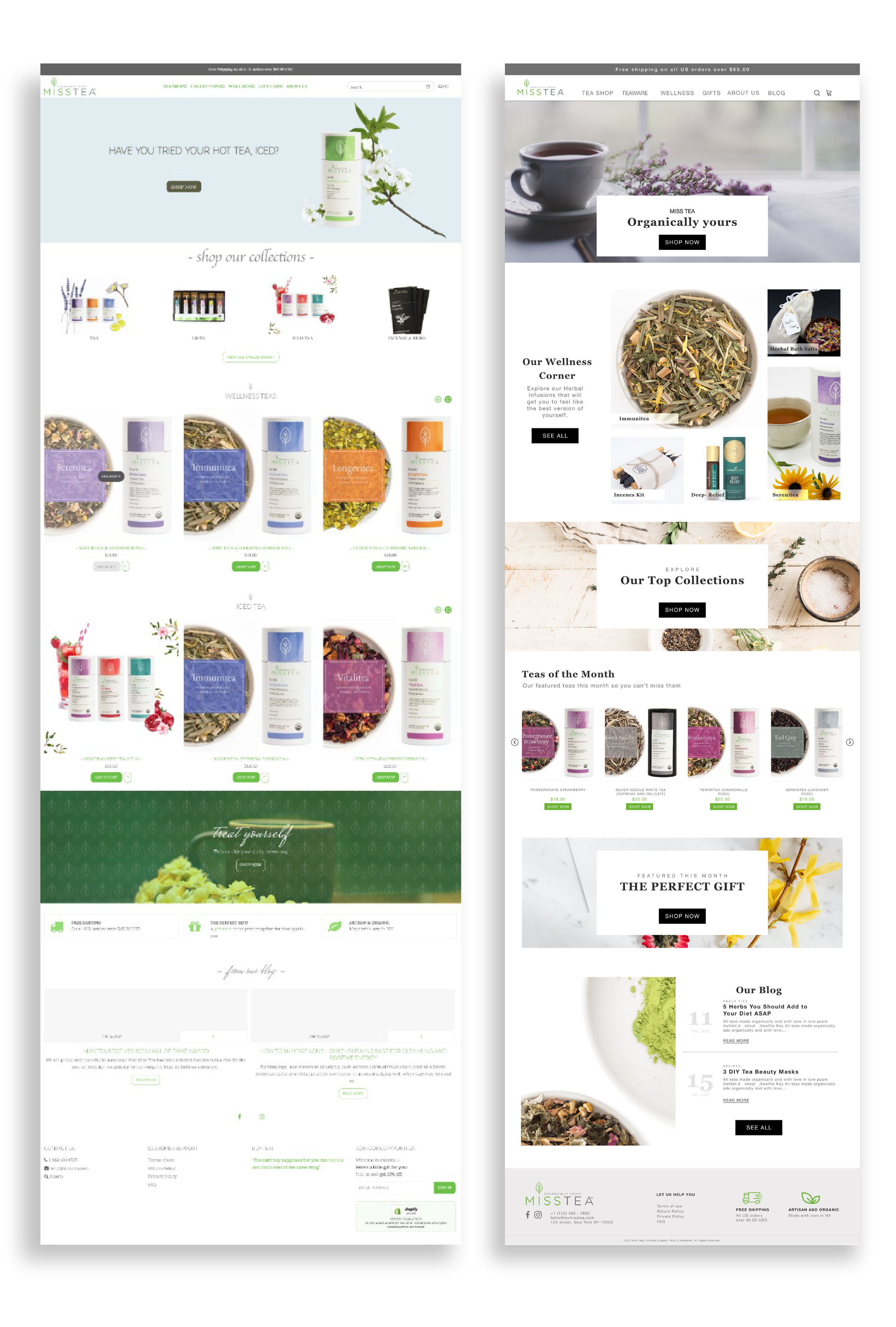
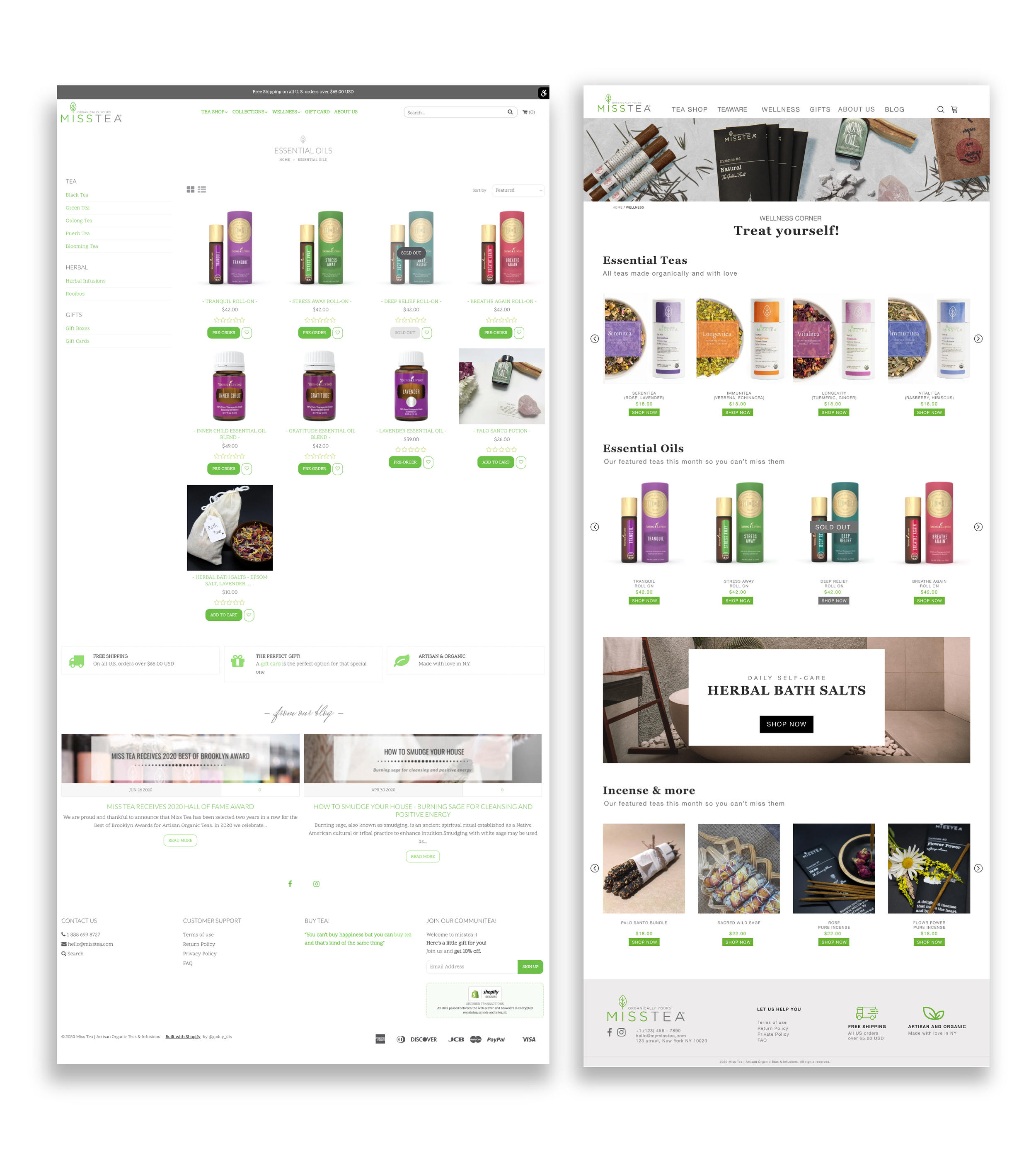
Homepage Before
The homepage was visually unorganized
Lack of coherence in the graphic universe
The header was missing essential categories
The footer was disproportionately large.
The homepage did not provide a clear
navigation path to various categories
There was an absence of a defined product hierarchy
Homepage After
Defined a clear and consistent graphic universe
Implemented a new header with well-defined product categories
Added CTA buttons to facilitate a clear purchase path
Designed a narrower footer with only essential information
Defined product hierarchy
Product Before
Disorganized product presentation
Lack of spatial structure and layout
Absence of incentives for cross-selling and upselling
Product After
Streamlined and simplified information architecture for better usability
Utilized grid systems with columns and rows for a clear visual hierarchy and layout
Introduced visually distinct CTA buttons to guide user interactions
Introduced cross-selling and upselling area at the bottom to incentivize purchases
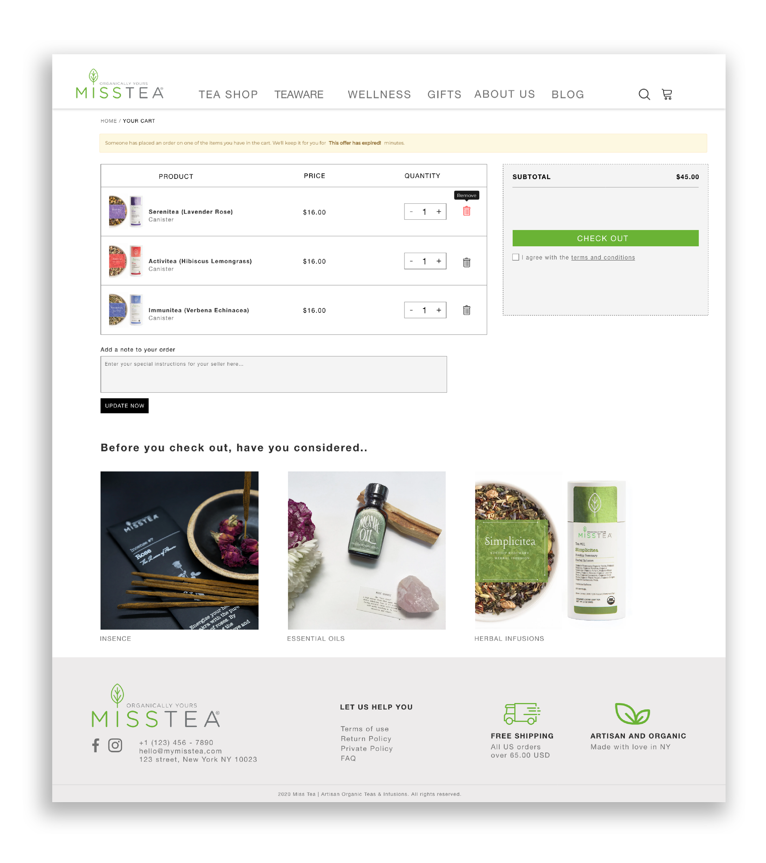
Checkout Section
Designed an intuitive payment process for seamless transactions
Simplified checkout steps to minimize user friction
Implemented clear, actionable prompts guiding users through payment
The Outcome
Client reported their conversion rate increased by 50% by the first week of launching the new website.
AOV per user doubled as well given the users were able to easily distinguish categories and find products.
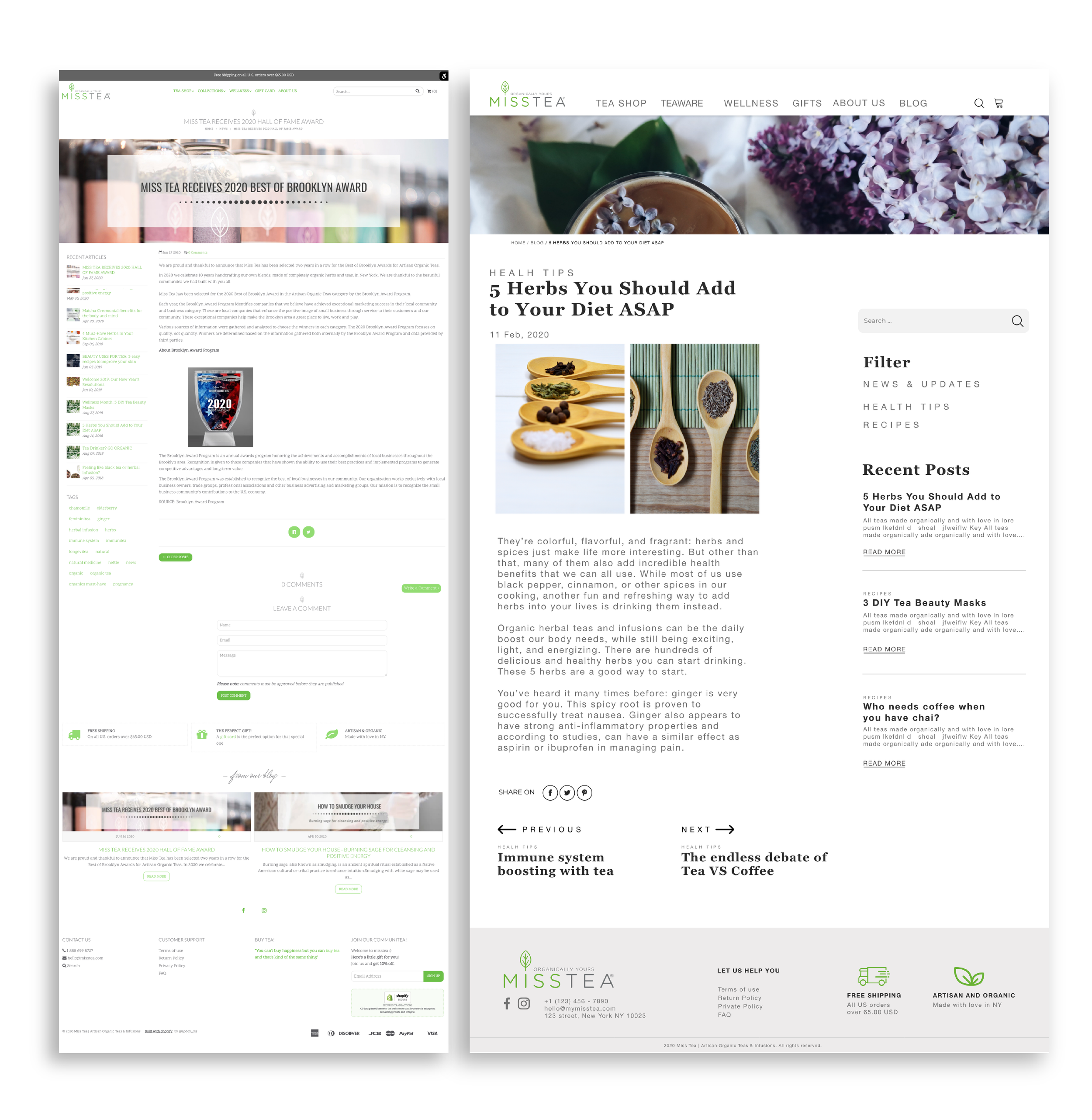
Blog Page After
Integrated the blog into the main website to enhance user engagement.
Developed a clear information architecture to ensure intuitive navigation and content discoverability.
Blog Page Before
The blog was accessed through an isolated link, disrupting user flow.
The lack of space structure disrupted visual hierarchy and readability.